top of page
.png)

Berare Cosmetics
REBRANDING | STRATEGY | PACKAGING | CREATIVE DIRECTION
Berare Cosmetics is a beauty and personal care brand based in Sullia, Karnataka, established in 2022 through its digital launch on Instagram. The brand focuses on skincare, haircare, and beauty essentials with a strong emphasis on natural, safe, and modern beauty solutions.
We helped them redefine their brand architecture and created a new identity system across ranges that represents a shift
Brand Identity
The Berare Cosmetics identity system includes three primary logo variations designed for flexibility and consistency across different brand applications. These variations help maintain a consistent visual identity across both digital and print platforms while adapting to different design needs.


Brand Colors
Primary Colors
The color palette of Be Rare Cosmetics is designed to create a clean, modern, and trustworthy brand identity. The combination of blue tones reflects purity, confidence, professionalism, and skincare-focused beauty.

Variant Primary Colors
Variant colors are used to support the primary palette and create visual balance across packaging, social media, and brand applications.”


Brand Pattern
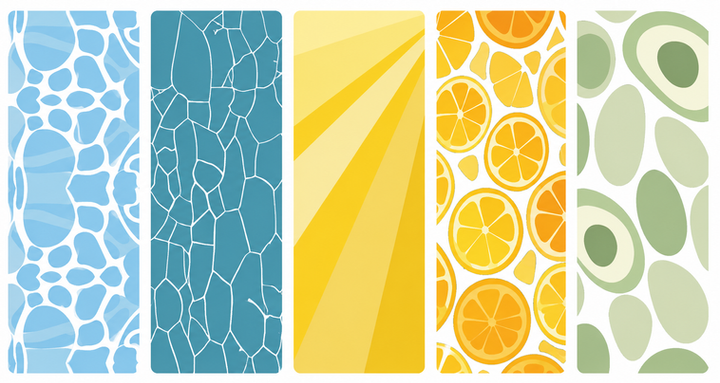
Water
Cells
Sunlight
Orange
Avocado
Pattern Usage


The Berare Cosmetics pattern is inspired by the fluid and organic forms found in nature, particularly the movement and flow of water.
The blue color variation represents freshness, purity, and clarity. Inspired by the calming nature of water, it reflects the face wash’s acne-control properties.

.jpeg)
Pattern Usage


To create distinction across product ranges, the pattern is adapted into different color variations while maintaining the same visual structure. Each color variation helps identify a specific product category while ensuring consistency throughout the brand system.


Pattern Usage


To create distinction across product ranges, the pattern is adapted into different color variations while maintaining the same visual structure. Each color variation helps identify a specific product category while ensuring consistency throughout the brand system.


Pattern Usage


The cell-inspired pattern is derived from the microscopic structure of skin cells, representing skin health, renewal, and protection. Its organic interconnected forms reflect the scientific and skincare-focused approach of the brand while creating a unique and recognizable visual identity.

.jpeg)
Pattern Usage


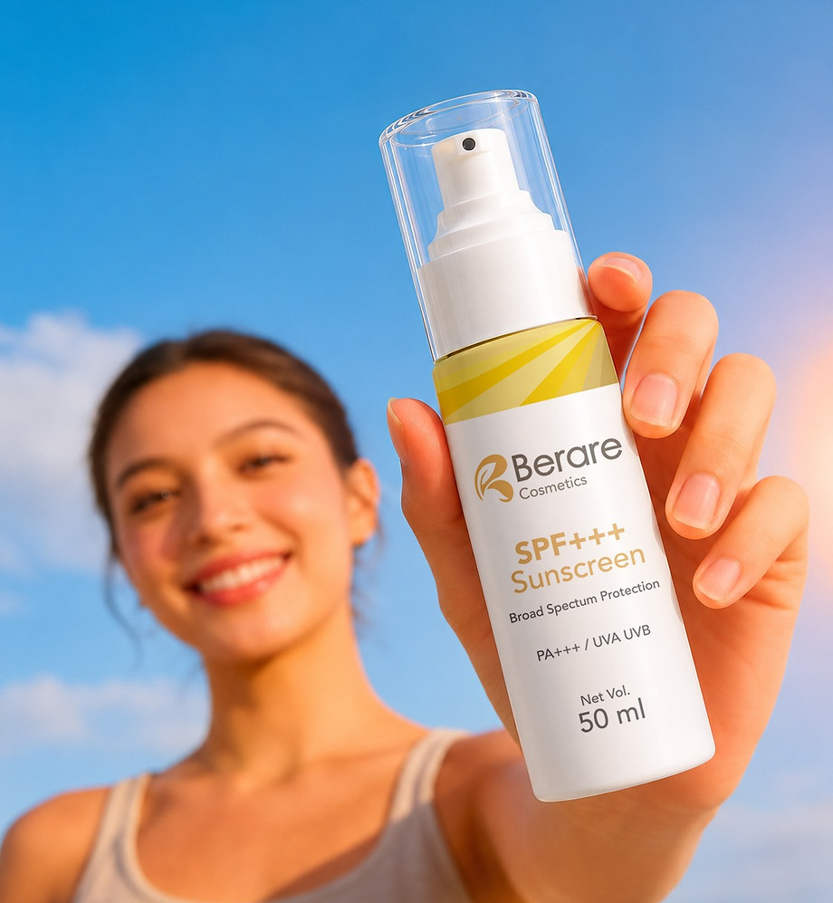
The sun ray pattern is inspired by the natural movement of sunlight and is used for the sunscreen product range. The radiating forms symbolize protection, warmth, energy, and daily sun care. This pattern helps visually communicate the products purpose while creating a bright, clean, and distinctive appearance within the Be Rare Cosmetics packaging system.

Pattern Usage


The orange illustration is inspired by fresh citrus fruits, reflecting the key ingredient of Vitamin C.
The vibrant orange elements create a fresh and uplifting appearance that aligns with the products brightening properties.


Pattern Usage


The avocado illustration is inspired by the nourishing qualities of natural ingredients and represents skin repair, hydration, and balance. The organic forms help create a natural and skincarefocused identity for the product range.


Brand Illustration
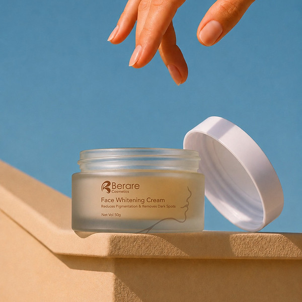
The brand illustrations of Be Rare Cosmetics are inspired by soft organic curves and natural beauty elements. These minimal line illustrations represent elegance, skincare, softness, and self-care while creating a clean and modern visual identity for the brand.
.jpeg)

Face
.jpeg)
Hands
.jpeg)

.jpeg)
Brand Collateral
The brand stationery of Be Rare Cosmetics is designed to maintain a clean, professional, and visually consistent brand identity across all official communication materials.

Brand Packaging


.jpeg)
Social media

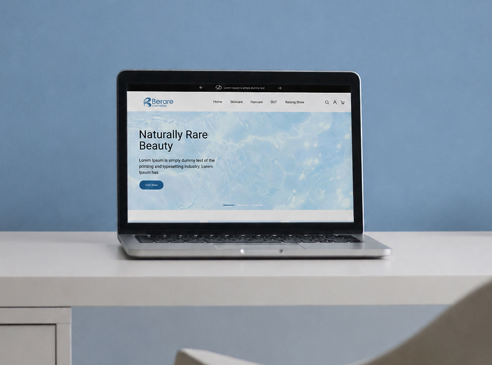
Social mediaThe social media applications of Be Rare Cosmetics showcase how the brand identity is visually maintained across digital platforms. The use of consistent colors, typography, product photography, and brand patterns helps create an engaging and recognizable online presence while reflecting the brands modern and premium personality.

bottom of page